
Web Design :: Lessons :: Website Planning
Web Page Anatomy
Good web sites are always planned before work is done in Dreamweaver. This can be on paper or in a computer program such as Photoshop or Illustrator. Before we get into the actual planning of a web site it is good to know a few standards of web sites.
The layout example below is just one way of many to layout a web page, but the key is the elements of the layout. Nearly every web page has all of the components of the layout below. It is important to note that the example layout below is not how every page should be laid out. In fact, web design would be boring if that layout was used all the time. Look at well-designed websites to come up with a more interesting layout.
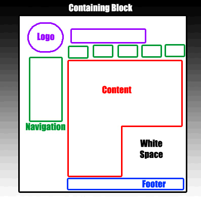
- Containing Block: A container is the one part of the layout above that EVERY web page must have. Generally the container is the <body> HTML tag of the web page, but a <div> tag is sometimes used as well. Tables used to be used, but they should no longer be used as container elements.
- Logo: The logo identifies the web site, and should be present at the top of every page. It helps to create consistency throughout the site.
- Navigation: Unless you have only a single web page, navigation is essential for visitors to get around your web site. The main navigation can be on the left, right, or top of the page and oriented however you want. It is important to make sure the main navigation is no more than 400 pixels down the page, however, to make sure it is accessible from the beginning to all visitors.
- Content: This important part of your page is the reason people visit your web site. Without this section your web page would have nothing of interest.
- Footer: A footer generally contains copyright information, contact information, and occasionally a small bit of navigation to main sections of the site.
- White Space: This term refers to space in your web site that literally contains nothing. It is important to leave some space on your site so it doesn't feel closed in and cluttered.
Page Balance
A common way to plan a site is by taking a standard 8.5" by 11" piece of paper and dividing it into thirds. This is what is known as the Rule of Thirds and it has to do with a common occurrence in nature known as the golden ratio. There is some math involved in the golden ratio, but the ratio occurs so often it is given the special symbol  , or phi. Use this grid every time you plan a website to make sure the layout will be visually pleasing.
When you use the Rule of Thirds there are a number of different ways to provide balance on your website.
Symmetrical Balance:
This balance occurs when elements of a website are on the same side of an axis line. A common use of symmetrical balance is horizontal symmetry, in which the content is split by an imaginary axis in the center of the page. This effect can be achieved by centering all content or dividing it into two columns.

Asymmetrical Balance:
This balance is also known as informal balance, and can be more visually interesting than symmetrical balance. Rather than having mirror images asymmetrical balance involves objects of differing sizes, shapes, tones, or placement. The objects are arranged, though, so they equalize the weight of the page. A large object on one side of the page would be balanced by several smaller objects on the other side. This is actually more common than symmetrical balance on the web.
Common Page Layouts
There are already a number of layouts you can choose from since web design has been around for over a decade now. Although you don't have to use one of these layouts they may be a good starting point for designing your site.
Left-Column Navigation:
Left-column navigation has recently fallen out of favor on the internet. However, a lot of sites use left-column navigation even if the left column isn't the main navigational choice. Users are very familiar with left-column navigation, but left-column sites can seem boring if they are not designed well.
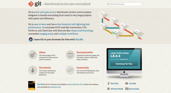
Top Navigation:
This type of navigation is becoming more common on modern websites. The navigation is present on the top of the page and sometimes contains drop-down menus.
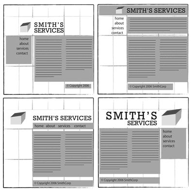
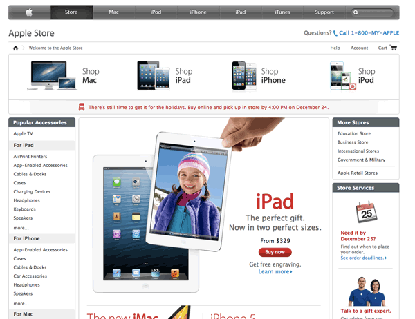
Dual Navigation:
This combines the top and left navigation. Usually there is a dominant and a secondary navigation option. In the example below the top navigation is secondary to the left navigation.
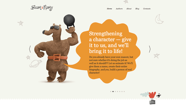
Minimal Navigation:
This type of navigation is typically used on smaller websites that do not have as many sections. For this reason it may be a good option for some of your early websites. The navigation is not located at the top or left of the page, but is still prominent.
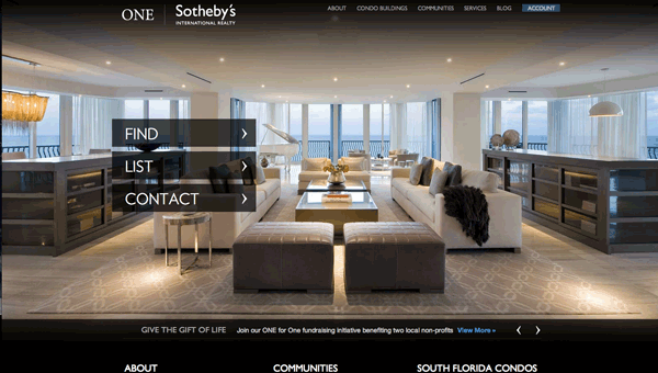
Main Button Navigation:
The example for minimal navigation could also be considered a form of this navigation as well. Main button navigation has a large button (or buttons) for the most common option on the website. Political campaign websites will use this option a lot for their donate option.

Three-Column Navigation:
Typically a three-column site has a wide center column with navigational columns on each side. This is generally used for a site with a lot of content, such as an online store, but it is still important to remember to implement white space.
Planning Steps
Complete the form below for any websites you plan to make.


