Web Design :: Lessons :: Color Choice
Color Psychology
Choosing colors is not as simple as just picking your favorite colors. Certain colors go well together while other color combinations may be displeasing to the eye. Since modern computer monitors can display more than 16 million colors it is a lot more difficult to pick a good combination of colors than it was when monitors could only display a maximum of 256 colors. We will touch on the basics of color in this lesson, and learn of a good resource for choosing colors in the Color Scheme Designer.
Different colors evoke different emotions. Although not everyone responds to colors in the same way below are some of the emotions attributed to colors most often in the Western World.
To find examples of websites using the following colors try searching for
website examples using color
where color is the specific color website you are looking for.
Try this search with blue: Google
Red
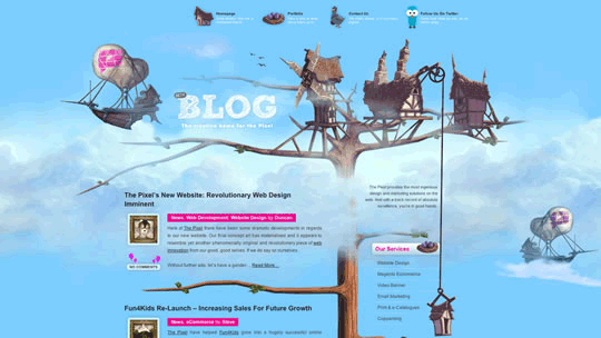
The color red can stimulate adrenaline and blood pressure as well as increase metabolism. It is an exciting color and is known mostly as the color of passion. This passion can represent anger as often as love. Darker reds, like burgundy and maroon, have a richer feel to them than the lighter shades of red. Finally, brownish reds are most commonly associated with the fall.

Blue
Blue is known to calm people down, but it can also reduce appetite. There aren't many natural blue foods so it isn't the most appetizing color. Blue is sometimes seen as a sign of trouble and is associated with depression. However, it is also appealing because of its association with the ocean and the sky, which signify life. Darker blues are usually more associated with depression while lighter blues evoke the sky.
Orange
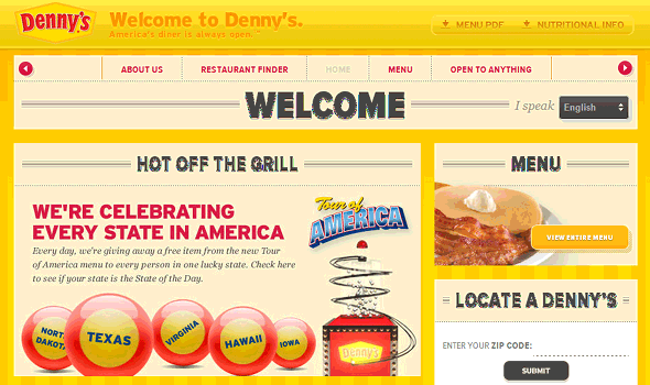
Orange is a very energetic color but it doesn't evoke the anger that yellow or red can. Orange is generally used to represent happiness, enthusiasm, and creativity. Orange is very informal and not a very corporate color. Orange is also good at stimulating the appetite.

Yellow
Yellow is a very active color that is associated with happiness and energy. The original lemon-lime version of Gatorade is still the best-seller, possibly due to the energetic qualities of the color yellow. Too much yellow, however, can be overpowering so it should be used carefully.
Green
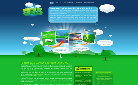
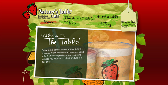
Green is most obviously associated with nature and can symbolize growth, freshness, and hope. It is easier on the eyes and less active than red, yellow, and orange so it can be used as a calming color.
Purple
Purple is most commonly associated with power and royalty. It used to be difficult to produce purple dye which is why it came to be associated with wealth. Purple is the least-used color on the internet so using purple as your main color would be a good way to make your site stand out.

White
Cleanliness is one of the first things people think of when they think of the color white. It is also the color of perfection, light, and purity.

Black
Although black can be seen to represent death it can also represent power and elegance, which is why many people like buying black cars or black laptop computers.

Color Schemes
Color schemes combine different colors together into effective (or ineffective) combinations. There are six main schemes and choosing a theme should come after a color has been chosen first. You can use the Color Scheme Designer to find a color you like and then design your color scheme.
Note that all colors on the web have a hexadecimal number, which you can find when you hover over colors in the Color Scheme Designer You can use these numbers to find the exact color you want in Dreamweaver.
To find examples of websites using the following color schemes try searching for
color scheme color website examples
where color scheme is the specific website color scheme you are looking for.
Try this search with monochromatic: Google
Monochromatic
 A monochromatic scheme uses a single color and a number of tints and shades of that color. This is probably the easiest scheme to pull off since shades of the same color almost always work well together.

Analogous
 An analogous scheme represents colors adjacent to each other on the color wheel such as green and yellow.

Complementary
 Complementary color schemes are colors that are located across from each other on the color wheel. There is a tool to find complementary colors on the Color Scheme Designer. Many sports teams, including the Chicago Bears and Minnesota Vikings, use complementary color schemes because of how well the colors go together.
 Complementary colors can be wonderful when used correctly, but they can also be horrible when used incorrectly. An effect known as simultaneous contrast occurs when complementary colors are used in a foreground/background relationship.
Another problem occurs when colors are chosen that aren't directly opposite of each other, but aren't close enough to be analogous colors. This is known as discordant colors and is why it is important to use the Color Scheme Designer to find complements. The use of discordant colors was actually very popular in the 1980's and can actually be used well in some cases.
Accented Analogous
 Sometimes known as split-complementary this color scheme uses analogous colors along with complementary colors.

Triadic
 A triadic color scheme is similar to accented analogous, but the split-complements move one more space on each side to be equally spaced on the color wheel. The triad tool in the Color Scheme Designer will find triadic colors.

Tetradic
 The tetradic color scheme involves four colors, which are two pairs or complementary colors. It can be difficult to use more than three colors well in a color scheme, but the site below shows it can be done.