Computer Applications I :: Lessons :: Announcements
Layout of an Announcement
An announcement page is meant to bring attention to itself and convince people to take a closer look. For this reason you need to include a catchy title and an interesting image. An announcement page is usually laid out with the following components:
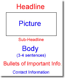
Headline and Sub-Headline
The headline should be large enough to be easily read from a short distance and it should be at the top of the page. WordArt is a good choice for this part. The headline does not need to say what the announcement is about, but it should be catchy and be somehow related to the announcement subject.
The picture should obviously have something to do with the announcement, and it should be something that attracts people to the announcement.
The sub-headline appears below the picture, and should provide more details about the announcement subject. The sub-headline should always be smaller than the headline.

Bulleted Lists
The body of your announcement does not need to be long. 3 or 4 sentences should be long enough, and the text should be styled to match the rest of the announcement.
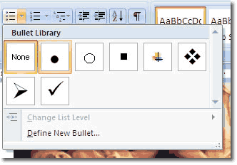
The next part should have a few bullets that highlight important information about your announcement such as times and pricing. The bullet library is available in the Home Tab and allows you to choose pre-made bullets or create custom bullets.
Finally, the contact information should not stand out much, but it should be centered at the bottom of the page so it is easy to find and it should fit the style of the rest of the announcement.