
Computer Applications I :: Lessons :: Functions
Average, Maximum, Minimum
Excel and Google Sheets contains hundreds of functions that can perform simple or complex calculations on your data. While it would be impossible to cover all of the functions in one semester, we will cover some of the important ones. In fact, we have already used the Sum function in a number of our projects. This lesson will focus on three more important functions: Average, Max, and Min.
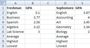
- Create your spreadsheet like the one below:
Excel Instructions
- Click in Cell B7.
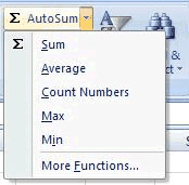
- Go to Home>Editing>AutoSum>Average.
Google Sheets Instructions
- Click in Cell B7.
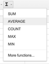
- Click on the Functions button on the right and choose "AVERAGE".
- Highlight Cell B2 through Cell B6.
Both Excel and Google Sheets have an arrow that give you access to some of the most commonly-used functions in the programs. When you choose the Average function a marquee (the marching ants) will appear around the data that Excel thinks you want to find the average on. Google Sheets requires you to select the data yourself. You can change the selection by pulling on the corners of the marquee, but in this case Excel should have it correct. You should see "=AVERAGE(B2:B6)." The colon in between B2 and B6 means through. So what is happening is Excel is finding the average of Cells B2 through B6. Now let's find the highest and lowest GPA for the freshman.
Excel Instructions
- Click in Cell B8.
- Go to Home>Editing>AutoSum>Max.
- Drag the marquee to include Cells B2 through B6.
Google Sheets Instructions
- Click in Cell B8.
- Click on the Functions button on the right and choose "MAX"x.
- Drag the marquee to include Cells B2 through B6.
Note that we had to change the marquee selection for this function because Excel tried to include the average we calculated when determining the maximum. While our result wouldn't have changed it is still important to make sure the correct data is being used in functions. An alternative to dragging the marquee is editing the function in the Formula Bar. You can also type the entire function in the Formula Bar, which is what we will do for the lowest GPA.
- Click in Cell B9.
- In the Formula Bar type "=MIN(B2:B6)".
- Click-and-drag over Cells B7 through B9.
- Press "Ctrl-C" to copy the cells.
- Click in Cell E7.
- Press "Ctrl-V" to paste the formulas.
- Round all numbers using Increase/Decrease Decimal to 2 decimal places.
- Click in Cell B7.
- Hold down the "Ctrl" key.
- Click on Cell E7.
- Go to Insert>Charts>Pie
- Choose one of the single pie chart options
- Right-click on the pie chart
- Choose Select Data...
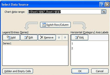
- Click the Edit Button under Horizontal Axis Labels
- Click on Cell A1 that holds the text "Freshman"
- Hold down "Ctrl"
- Click on Cell D1 that holds the text "Sophomore"
- Press "Enter" to submit the changes
- Title your chart "Average GPAs"
- Go to Insert>Pie
- Right-click on the pie chart
- Choose Select Data...
- Click the button to the right of Chart Data Range
- Click on Cell B8
- Hold down "Ctrl"
- Click on Cell E8
- Press "Enter" to submit the changes
- Click the Edit Button under Horizontal Axis Labels
- Click on Cell A1 that holds the text "Freshman"
- Hold down "Ctrl"
- Click on Cell D1 that holds the text "Sophomore"
- Press "Enter" to submit the changes
- Title your chart "Lowest GPAs"
- Create a pie chart for the highest GPAs
When you type functions directly into the Formula Bar it avoids the problem of Excel misjudging the data you want to use. Sometimes this is a much easier way of using functions, but either way should work. Now we just need to find the average, highest, and lowest GPA for the sophomores. You can copy-and-paste the formulas from the freshman section to do this.
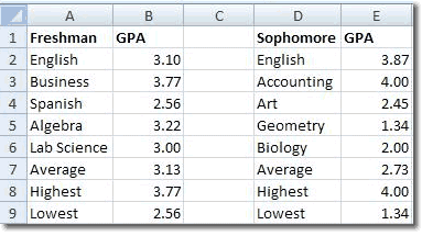
Finally, a GPA normally has two decimal places so we want to round all our number to two decimal places. You can highlight multiple cells at once, or round them one at a time.
After rounding, your spreadsheet should look like the one below.
Selecting Data From Disjoint Cells
Sometimes you will find that the data you need for a chart isn't conveniently located in one place. You may need to select two or more cells that are disjoint, or not next to each other. This will be the case with the chart we are going to make for the averages.
You should see both cells highlighted now. It is important that you hold down the "Ctrl" key at the correct time. A common mistake is holding down the "Ctrl" key before clicking on this first cell. This causes the cell that was previously selected to also be included in the selection. If you notice when creating a chart that it has one extra data field than this is most likely the problem.
Editing Chart Data
The pie chart will be added to your spreadsheet, but you may notice that the legend is not labeled. We want it to say "Freshman" and "Sophomore," but it simply says "1" and "2." We can fix this by right-clicking on the pie chart and editing where it pulls its data from.
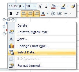
In addition to changes legend of axis labels you can also use Select Data... to change the data that a chart uses. However, it is much easier to select the data ahead of time. There are cases where you may find it easier to select the data after creating the chart so let's try it out once.
You can use either method of creating charts you prefer, but it is always important to remember how to use the Select Data... option since there will be many situations in which you will find it useful. Let's complete the lesson by creating a chart for the highest GPAs.


