
Computer Applications I :: Lessons :: Presenting Tips
Fonts
Anyone can make a presentation in PowerPoint, but when it comes to using PowerPoint to give a presentation we can all agree we have seen some bad/boring presentations. Below are some tips you should follow when giving a PowerPoint presentation.

You should use a san-serif font such as Arial or Helvetica. These fonts are easier to read when projected. The text above has serifs highlighted in red. You will also want to avoid using italics since they can be difficult to read. If you want to emphasize text use different styles, sizes, or colors. Finally, make sure the color of your font does not clash with the background. If you have a dark background use a light-colored font, and if you have a light background use a dark font. Even if the text is legible on the computer screen it may be hard to read when projected.
It is also important to use the same font throughout your presentation, unless you mean for a slide to be visually different. It is important to stay as consistent as possible when designing your slide show so people aren't distracted by the slides.
As a general rule, use a font that is 24-point or larger. Anything smaller than this becomes hard to read from far away. In addition, you should have a title on every slide that is larger than the normal text or stands out in some other way.
Do not use paragraphs in your presentation. All text should be organized into small blocks or bullets. Follow the 6x6 Rule that says you should have no more than 6 bullets per slide and 6 words per bullet. Your bullets do not have to be complete sentences.
Graphics
Make sure your background are consistent and subtle. Do not use pictures in the background unless the picture contains a large amount of solid color. It can be very difficult to make text legible in front of a picture background.
Make sure your slides are uncluttered and have some empty space around text and images. Also make sure the images you use are not blurry and do not have text (such as names or web addresses), images tags (generally a company logo), or watermarks (a logo or text in the background of an image).
You can use animations in your slideshow, but don't go overboard. You don't want the audience distracted by animations. Along these lines make sure your motion-path animations are subtle and short. Finally, make sure you have a slide transition on every slide so the audience has a visual cue for a slide change. However, do not use more than 2 or 3 different transitions.
Presentation
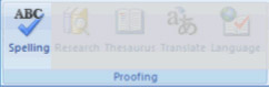
Make sure you check the spelling and grammar. You can go to Review>Proofing>Spelling in PowerPoint or Tools>Spelling in Google Sheets to check the spelling in your presentation.
You may want to give an introduction before beginning your presentation. It is good to have your audience know the point of your presentation before you begin. Also, do not simply read the bullet points. This is a common mistake and can lead to the audience ignoring you and simply reading the slides. It may help to make the bullets appear one at a time by using animations. If you use sound effects in your presentation wait until the sound is finished before you resume talking.
Finally, make sure you never sit down during a presentation. Use a remote or have someone else click the mouse for you. Never turn your back to the audience and make sure you speak to all sides of the room equally.


